

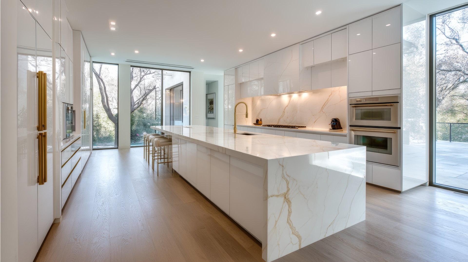
Color is one of the most powerful elements in any home, and when it comes to luxury vinyl plank (LVP), choosing the right tone can completely shape the feel of each room. Warm and cool tones behave very differently—each influencing light, mood, and the overall design story in its own way. For homeowners planning a remodel, understanding how these tones interact with natural lighting, décor, and layout is the key to selecting a color palette that feels truly at home.
LVP offers a beautiful advantage here: an endless range of hues inspired by hardwood species, weathered textures, and modern finishes. From cozy honey browns to airy grays and sleek taupes, there is a tone for every style. The goal is finding the one that not only matches personal taste but also enhances daily living.
What defines warm and cool wood tones?
Before exploring home applications, it helps to understand the difference between warm and cool LVP tones. Warm tones lean toward yellows, reds, and golden browns. Think rustic oak, caramel birch, or sun-kissed hickory. These shades create an inviting atmosphere and often feel timeless.
Cool tones, on the other hand, include grays, washed taupes, soft charcoals, and ashy browns. These colors have blue or green undertones, making them ideal for modern, airy, or minimalist spaces. Cool tones visually expand a room, giving it an open, relaxed appearance.
Why warm tones feel comforting and classic
Warm LVP tones have a long history in home design. They naturally evoke comfort, making them popular for living rooms, bedrooms, and family gathering spaces. These colors work especially well in homes with:
Cream, beige, or tan furniture
Traditional or farmhouse décor
Brushed gold or antique brass fixtures
Natural light with a warm afternoon glow
Warm tones also help counterbalance larger spaces that feel too open or bright. They ground the room and bring an easy sense of balance. If a home leans toward cozy, inviting aesthetics, warm LVP floors seamlessly support that direction without overwhelming the space.
Cool tones create a modern, breezy atmosphere
Cool-toned LVP has exploded in popularity thanks to its versatility and clean look. Homeowners who prefer Scandinavian simplicity, coastal freshness, or contemporary lines often gravitate to these shades. Cool tones look especially beautiful when paired with:
White, black, or gray-based furniture
Chrome, nickel, or matte black hardware
Soft blues, greens, or charcoal accents
Homes with bright, natural light
Another advantage: cool tones reduce visible dust and footprints more effectively than many warm shades. For busy households or homes with pets, this added practicality can be a strong bonus.
Understanding your home’s lighting before choosing a tone
Lighting plays a surprisingly big role in how LVP color tones appear. Even a beautiful plank can look completely different depending on sunlight direction and fixture color temperature.
Morning light vs. afternoon warmth
East-facing rooms receive crisp, blue-based morning light—a perfect match for warm LVP tones to soften the environment. Afternoon light, on the other hand, tends to be warmer and works harmoniously with cool LVP in west-facing rooms to offset the intensity of golden sunlight.
Warm lighting vs. cool LED bulbs
Artificial lighting can shift tones too. Warm bulbs enhance golden tones and may make gray floors appear slightly beige. Cool LEDs highlight the blue undertones in cooler LVP, giving the room a fresh feel. Thinking about lighting early ensures the chosen floor tone looks intentional all day long.
Blending warm and cool tones throughout the home
Many homeowners assume they must choose between warm and cool tones—but blending both can create an elevated, layered look. This often works well in homes with open floor plans or eclectic design styles.
Consider these combinations:
Warm floors with cool-toned furniture to balance the palette
Cool gray LVP paired with warm woods such as walnut shelving
Warm honey floors with matte-black accents for depth
The trick is making sure undertones complement rather than clash. For example, a red-based warm tone won’t pair well with a blue-based cool tone, but a neutral taupe often blends beautifully with both.
Matching LVP tones to décor styles
Different shades tend to support different interior design themes.
For farmhouse or rustic homes
Warm, weathered browns and subtle golden hues feel authentic and timeless.
For coastal or airy interiors
Soft grays, driftwood-washed tones, and cool beige bring a relaxed seaside feel.
For urban modern spaces
Charcoal-inspired cool tones or subtle greige neutrals work beautifully with minimal décor.
For traditional homes
Mid-tone warm browns offer richness without overpowering classic furnishings.
By aligning flooring tones with long-term décor preferences, it’s easier to create cohesiveness—no constant repainting or redesigning required.
Creating harmony from room to room
In multi-room homes, LVP tone transitions should feel smooth and guiding. Whether sticking to one tone throughout or mixing hues strategically, consistency in undertones keeps the home feeling unified. A thoughtful palette ensures the eye moves naturally from space to space.
Ready to explore warm and cool LVP options?
For Denton homeowners who want expert guidance in finding the perfect LVP palette, Smitty’s Floor Covering brings decades of trusted flooring experience. Our team helps match tones, styles, and textures to your home’s lighting and layout, backed by dedicated installation services and free in-home measurement. Contact us today to discover why Denton County has relied on our flooring experts since 1958.


